
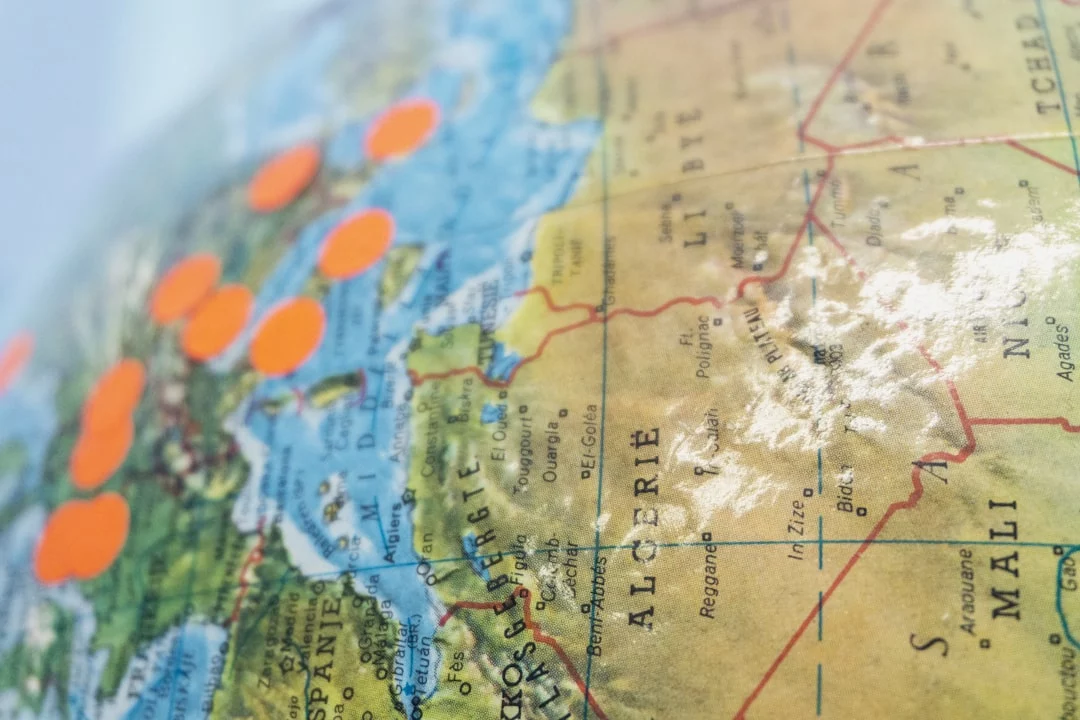
The Africa true size map debate exposes one of cartography’s most enduring illusions. On the familiar rectangular world map, Greenland appears comparable to Africa, Europe looks disproportionately commanding, and lands near the equator seem visually diminished. Yet Africa is about 14 times the size of Greenland and covers roughly one-fifth of Earth’s land area. Renewed calls for international institutions, including the United Nations, to favor fairer map projections have transformed a technical cartographic issue into a passionate argument about education, power and how humanity pictures itself.
The dramatic claim that the UN has simply
Frequently Asked Questions
Why does the Mercator projection make Africa look smaller than it really is?
The Mercator projection enlarges areas increasingly toward the poles while preserving local angles and directions. Because Africa lies mainly near the equator, it receives relatively little enlargement. Greenland, Europe, Canada and Russia are stretched much more, creating the false visual impression that they are closer to Africa in size than they actually are.
Is there a completely accurate flat map of the world?
No. Turning Earth’s curved surface into a flat rectangle inevitably distorts area, shape, distance or direction. Different projections prioritize different properties. Equal-area projections preserve relative land area, while conformal projections such as Mercator preserve local shapes and angles. The most appropriate map therefore depends on whether the goal is navigation, education, statistics or general reference.
Which map projections show Africa at a fairer relative size?
Equal-area projections such as Equal Earth, Gall-Peters and Mollweide preserve the proportional area of continents, so Africa appears correctly sized relative to Greenland, Europe and North America. They still alter shapes or distances, however. Compromise projections such as Winkel Tripel reduce several kinds of distortion but do not preserve area with complete mathematical accuracy.
Was the Mercator map originally designed to diminish Africa?
No. Gerardus Mercator developed the projection in 1569 primarily for marine navigation. Its straight rhumb lines allowed sailors to plot constant compass bearings conveniently. The shrinking effect is not caused by Africa being compressed, but by high-latitude regions being greatly enlarged. Its later use as a general classroom map made that technical distortion culturally influential.
Would changing the map used by the United Nations eliminate geographic bias?
Changing projections could improve public understanding of countries’ relative areas, but it would not eliminate every form of bias. Map centering, orientation, boundaries, labels and visual emphasis also shape perception. In addition, the UN uses multiple maps for different purposes, so claims that it relies on one universal projection or can simply replace a single map are misleading.
How large is Africa compared with other familiar regions?
Africa covers about 30.37 million square kilometers, making it the second-largest continent after Asia. It is roughly three times the size of Europe and about 14 times larger than Greenland. Its scale is often underestimated because commonly displayed world maps enlarge northern regions, while Africa’s equatorial position leaves its mapped area comparatively unchanged.